6 June 2019
Creating Simple Layout Templates with CSS Grid
There is so much to love about CSS Grid and the various methods it provides for defining a layout. Of course, with great power comes sloppy front end code. It did not take me long to muck up a grid layout leaving my team members with a tangled mess of grid-columns and grid-rows.
Label Page Components with Template Areas
Defining and rearranging template areas is one of the cleanest and straight-forward methods for creating template parts that can put together in different page layouts. Here is what a simple interchange grid would look like.
Define The Grid
First, we must define our grid lines. For this example, we will create three columns of equal width and three rows with a large center row.
body {
  display: grid;
  grid-template-columns: repeat(3, 1fr);
  grid-template-rows: 1fr minmax(300px, 65vh) 1fr;
}

Assign Your Template Areas
Once you have the grid lines set, we’ll create classes for the containers that will represent the different sections of our grid, and then assign each one a grid-area title.
.header {
  grid-area: header;
}
.main {
  grid-area: main;
}
.list__col-1 {
  grid-area: list-col-1;
}
.list__col-2 {
  grid-area: list-col-2;
}
.list__co3-1 {
  grid-area: list-col-3;
}
.sidebar {
  grid-area: sidebar;
}
.footer {
  grid-area: footer;
]
Defining The Layout
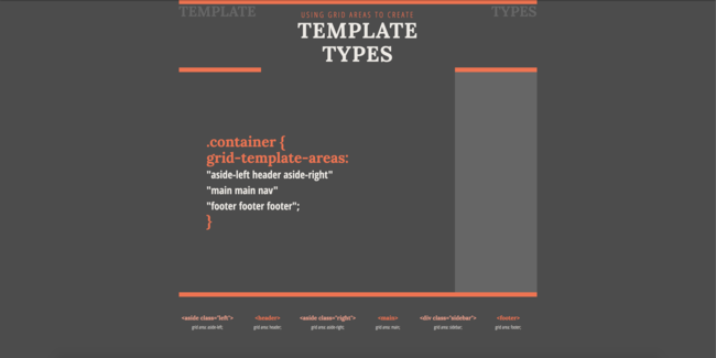
To define our base layout, we will be using the grid-template-area property. The names assigned to each container’s grid-area can be laid out according to the defined columns and rows. When we add each row of template areas to a new line, the css becomes a visual pattern of our grid layout.
body {
  grid-template-areas:
    "header header header"
    "main main sidebar"
    "footer footer footer";
}

Adapt The Layout for Different Template Types
Now we can get creative by defining several layout variations for separate templates. For this example, we will create CSS for an article template with header or sidebar and an article list template.
body.template__article {
  grid-template-areas:
    "main main main"
    "main main main"
    "footer footer footer";
}

body.template__list {
  grid-template-areas:
    "header header header "
    "list-col-1 list-col-2 list-col-3"
    "footer footer footer";
}

Now that we can easily create different types of variety of defined layouts, we can now consider how is method will help solve another problem. With the rise of design systems, we are building consistent components that are pieced together to create larger components that fit together into pages. We’re no longer designing simple pages, so how do we incorporate this great page layout method into a design system process?
More on that another day…


