19 November 2020
Every Pixel Matters: Tips to use them most efficiently
When you’re programming, one of the most important things is the code you’re writing. Because our brains are limited and our code is mostly not, you’ll want to see as much code as you can so that it’s easier to keep the whole context of what you’re doing visible. First, buy the largest, highest resolution display that you can. Second, dedicate as much of that screen to actual code that you can.
Back in my day
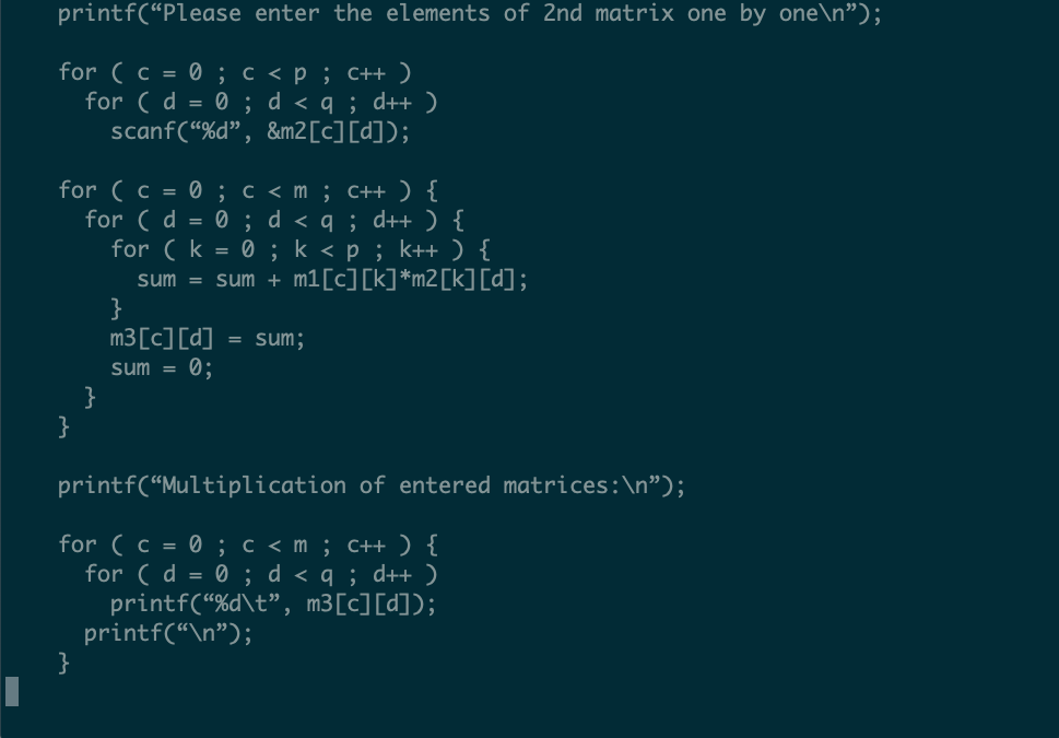
When I first started programming, I was writing embedded SQL in C on Unix systems. My first job that I was writing code all day, every day was for a large Fortune 250 company. We had a shared Unix server that all the developers worked on. I was running MS Windows 95 on a desktop computer with a 14” monitor. We used a program called Kermit to telnet into the development server. The terminal only supported 80 columns and 25 rows. That was it. That was our tiny looking glass into a system that had hundreds of thousands of lines of code.

This is 25 lines of a 69 line program. You can almost figure out what it’s doing. In my mind, vertical real estate is pretty important here. How much of the flow you can understand is largely determined by how much of it you can see. Also, variable names are highly compressed to save on column width. Honestly, there’s room here for better variable names; but it was very common to use single-letter variable names.
My first language was C and my second was Perl. Both are very dense languages. They were born out of a time when it was hard to see a lot of code at one time.
Fast-forward
Much like a child of the depression holding tightly to everything they own, my reaction to this has been to maximize how much code I can see at any given time. I’m currently using a Dell UltraSharp 27” 4k display that supports 3840x2160 resolution. Unfortunately, my old eyes aren’t as good as they used to be so I’m running it at 3200x1800. My editor is using a 16 point font!
How many lines of code will that display?
This is the point of my rant. The number of lines of code you can display depends on your monitor and font size; but it also depends on your editor settings!
Configure your editor to display as much code as you can.
My Setup
I’m not really an editor snob. I learned to program on vi before it was improved to become vim. I switched to using XEmacs because… it supported syntax highlighting! I used that for many years before switching to GNU Emacs along the way — I think because it had better native Mac support. By this time a bunch of people at work were using vim as their primary workspace. I don’t remember when, but I switched a fourth time to using spacemacs. It’s a combination of both emacs and vim.
My fingers and muscle memory is pretty good at vim golf. I know how to make every key count when it comes to navigating and editing code. However, I have found that how emacs treats buffers of open files and the window panes it displays them in to be the most flexible.

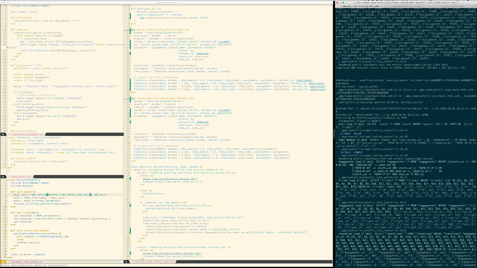
This is spacemacs and terminal in split-screen mode on my Mac. There’s a lot of considerations here.
No Tabbed Navigation
In my editor, I think tabbed navigation is an anti-pattern. It seems easy to glance up and see the tab for your most recently opened file and go click on it. However, in fairly short order I end up with many, many files open. The tabs either become abbreviated so that I can’t read them or you have to scroll through the tabs to see them all. Frankly, I’d rather not see the tabs at all and get more lines of code to display.
No directory and file browser tree
Most of our projects have a fairly discoverable file structure. Ruby on Rails was famous for standardizing on the directory structure so that you could easily find files. I definitely value that kind of structure. Once I’m familiar with the project, I don’t often browse the directories. Most of the time I know what class or module I want to open. That’s why using fuzzy-finding is the fastest way to open files. Hiding the directory browser allows me to see either more horizontal space for code that has very long lines, or I can vertically split the editor and see two files side-by-side.
Very little annotations
Most of the time I only have two annotations turned on: line numbers and highlighting from the code linter.
Line numbers are very important when pair programming. That allows you to quickly identify to your pair where you are looking. One point of pair programming is to stay in sync. If you’re both in person you can point to the screen. If you’re remote you can use your mouse to point. But nothing is faster or smoother than just saying, “Look on line 36.”
Everyone has their own opinions about how code should look and be formatted and few of us agree on everything. However, when working on a team it’s very important to have a consistent style across the entire project. That’s where code linters like rubocop and eslint are important to check, correct, and enforce style. I have spacemacs configured to show warnings and errors from rubocop inline.
No hidden text
I have spacemacs configured to soft-wrap long lines. You can see that in the image above in the upper left on line 15. If it’s valuable to have a long line of code (and sometimes it is) then it’s valuable to see the entire line. I have never memorized the key combinations to horizontally scroll an editor window. Grabbing the mouse to scroll a window so that I can see the whole line is tedious at best. It can also be a mental trap if you don’t know the line has been truncated because you might miss important logic that’s hidden.
Minimal fuss
There’s a lot of fancy features you can turn on in pretty much any editor. One way to improve focus is to remove distractions. The point is to focus on the code. The “modeline” is the divider between buffers in emacs. There was a time when I had all kinds of stuff displayed in it. I think the default for a fresh installation includes a new mail notification and flashing clock. I remove all of that extra stuff and just show the filename.
Splits
I like to see code side-by-side; especially the code and its tests. Often times when tests are complex or code is interdependent I’ll need to see several files at the same time. I like to see as much of the tests as I can and maximize as much of the other code I can see.
The question from above: how many lines of code can I display? One answer is 87. That’s how many lines fit if I only have one file open. However, in the screen shot above I actually have 168 lines of code visible and my tired old eyes can read each one pretty well.
No popup autocomplete
There are jokes all over the internet about mistakes autocomplete makes. Microsoft calls it “intellisense”. I’m ok with using tools like this to make typing easier. However, I’m not ok with it always popping up as I type every word. About half the time it completes to something I don’t want and then I have to stop and undo what it just did. I map autocomplete to a key combination. That lets me type a few characters of a long name, hit my key, and select the result I want.
The Terminal
I’m giving a lot of real estate to the terminal. This is one area where I think tabs work well. I only have a few terminals open at any given time: one to run my application server, one to run tests, and maybe one or two more for various command line activities. Sometimes I want to see the server output, which can be quite verbose. The same thing is true with tests. Context is king!
I see people who run their server or tests in minimized terminal windows with only 5 or 10 lines visible at a time. It’s too hard for me to understand what’s happening when a test fails with that much space. What I then see is that they’ll manually drag it open to see more from time to time, but that’s at the expense of their code window.
Give everything room to breathe.
The Conundrum
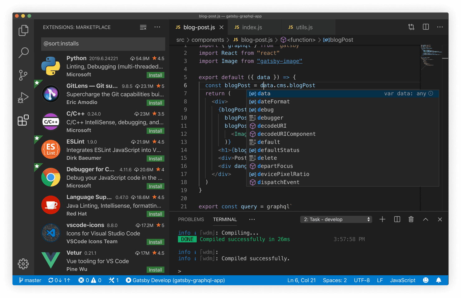
All that said, because I am largely pair programming with others at my company I don’t often get to pick the environment or editor we work in. There was a time that Atom was the most popular editor at work. Now I think Microsoft’s Visual Studio Code is probably the most popular

Granted, the screenshot above is meant to display lots of neat features VS Code supports. I’ve also seen people programming day-to-day with a layout that looks similar. Only 27% of the pixels in that picture are for showing code. While the autocomplete popup is displayed, only 13% are for the code.
There are lots of icons I have no idea what they do. There’s lots of information that seems irrelevant to writing code.
Tips for VSCode
The default view of VSCode can be cluttered with a lot of unnecessary or rarely used features. Here are some quick tips to free up space in your editor:
•	Remove mini-map: add “editor.minimap.enabled”: false; to your settings.json file
•	toggle file explorer: `command + b `
•	Activity Bar (icons at the left of window) can be toggled off by going to `View > Appearance > Activity Bar
It is also worth noting you can open a terminal window in VSCode with control + ~ if you’d like to run tests or a server without dedicating another window on your display to the terminal.
My encouragement is to configure your editor to let you focus on as much code as you can and turn off the bells and whistles.


