
27 February 2015
How to Design for Web Accessibility Standards

by Kristin Lasita
I’ve been hearing more about accessibility in web design over the past year. At MidwestUX 2014, I saw developer Greg Tarnoff talk about his life with a vestibular disorder, which causes dizziness and other symptoms that make it challenging for him to move through the world. He made a personal plea for people to start designing with accessibility in mind. I’ve also read about Facebook and Mailchimp working to include accessibility in their apps.
Then about three months ago I began working on a client project with a new-to-me requirement: accessibility. And not just “oh that’s nice” accessibility but Section 508 compliant accessibility. Now I was face-to-face with this design challenge, and so far, it’s been a terrific learning experience. I’ve been doing a lot of research, and I’d like to share what I’ve found with others new to designing for web accessibility standards.
Here’s the first thing to keep in mind: Web accessibility isn’t just about designing for the blind or visually impaired. People face a range of different issues, from struggling with rapid motion like Tarnoff to trying to understand audio if you have a hearing impairment to navigating the web with a screen reader if you’re visually impaired.
There are a lot of tips and tricks out there for writing accessible mark-up and JavaScript, but there’s a lot more to consider when you’re building an accessible app or website. Here are a few things to start incorporating on every project to help make the future web easier for everyone to navigate:
Think About Structure
Structuring your app into group-related elements is a great start. Take this approve/deny request example:
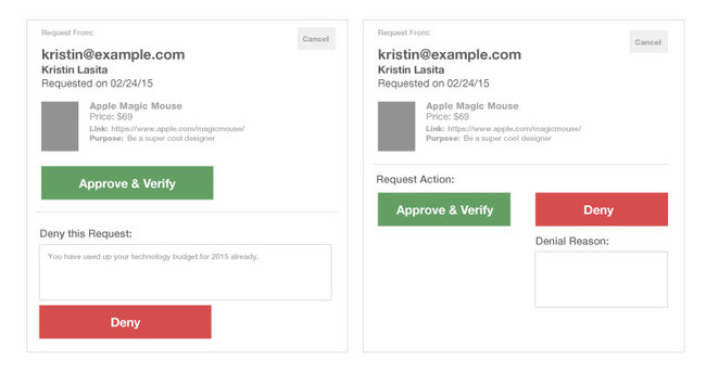
On the left, information about the requestor is at the top. ‘Approve’ is grouped in with requestor info and ‘Deny’ is below due to its added info. A better way to group this is presented on the right. By grouping ‘Approve’ and ‘Deny’ together, a user is able to quickly relate these two actions together.
ARIA landmark roles are a great starting point for creating a more accessible structure. These are the most common per the A11Y Project (a grassroots effort to make web accessibility easier): banner, search, form, main, navigation, and content info (footer).
Although you may never touch the code, designing around some of these landmark roles will make this easier for screen readers to quickly navigate around the page.
Use Identifiers
Labels are often the first thing designers cut when simplifying their work. While a sighted user can infer what the item is by visual cues, a user with a screen reader doesn’t have this luxury. There are workarounds, such as ‘aria-labelled-by’. This gives the screen reader a label that’s hidden from sighted users. The better solution: put the label on the screen. It may change your design, but in the end, it creates better usability for everyone.
Check Color Contrast
Color contrast for accessible web is well defined. The official Web Content Accessibility Guidelines (WCAG) call for “a contrast ratio of 4.5:1 for normal text and 3:1 for large text.” There are plenty of resources to check color combos for low readability, such as this one from WebAIM.
You also want to avoid relying solely on color to convey meaning. If you do want to use color this way, find a secondary way to indicate differences. One of my favorite examples of this is Trello Colorblind Labels. They rely on both color and pattern for differentiation. Pattern works as a great backup when a user can’t distinguish colors.
Go Simple
Upon first glance, the humble ‘tabbed-list’ seems like a simple web design convention. But executing this element to work with keyboard accessibility (many people with motor or vision challenges use keyboards exclusively) is no easy task. While a11y Project has a solution published, it’s a lot of markup for a small element.
It’s not that you should never use a tabbed list, but think through your decision. Does this really need to be in a tabbed list? Would stacking the content work just as well? Accordion menus fall into this category, too.
Give Safari and Voice Over a Shot
If you are currently working on a Mac, try the Voice Over tool. Go to your System Settings, choose Accessibility, and turn Voice Over on. You can also use the keyboard shortcut command + F5. Safari is the best web browser to use in this instance.
Just using the keyboard to fumble around and hear what the screen is telling you will raise your awareness. Go to a page, hit refresh, and the Voice Over will read through all the elements on the page automatically.
Need some good sites to explore? If you’re looking for a tough one, try “USA Today”. Looking for a good example? Any site with a .gov in the title is required to follow Section 508, such as cdc.gov.
Web Accessibility Resources
These are a few resources I’ve used. Although they do lean more toward the implementation side, they are still helpful.
a11y Project
As you can tell by my multiple references in this post, this is my favorite resource for accessibility on the web. Why? They have easy-to-understand articles that aren’t full of jargon. They only have a few things up now, but I hope to see this grow as more people contribute.
Apps for All: Coding Accessible Web Applications
This article on “Smashing Magazine” is a chapter from Heydon Pickering’s book. Although it’s a lot of details about implementation, there are some easy to digest concepts that anyone can benefit from reading.
Bootstrap
Since we use Bootstrap here at Gaslight, I’ve been learning about all the great things Bootstrap has worked in to aid accessibility. Just visit the homepage and use ‘tab’ keyboard navigation. They have done a great job integrating the ‘Skip Links’ method that helps screen readers avoid repetitive content. They also have accessibility only classes like “sr-only” and “sr-only-focusable” that allow a user to quickly add accessible points.
W3C
This is the official source. Honestly, it’s overwhelming unless you’re looking for something specific.
Finally, keep in mind that creating an accessible site or app doesn’t mean you can’t knock the visual design out of the park, too. Just look at the Apple website, which combines top-notch design and accessibility.