18 November 2014
Is Thoughtless Copy Ruining Your User Experience?

by Michelle Taute
A couple of weeks ago I received a phone call to virtually check me in a few days early for a routine medical appointment. After some basic questions about insurance and emergency contacts, the nice woman asked if I’d like to go ahead and pay for a planned test over the phone.
Me: Nah, I’ll just pay when I come.
Nice hospital phone operator: If you pay right now, I can give you 20% off and the full amount will still count toward your health insurance deductible.
Me: Awesome!
The nice woman took my credit card info, thanked me for my time and told me to look out for an email receipt. I was really stoked about saving just shy of $50 and told my husband how happy the whole thing made me when he came home from work. Then I opened my email to this little gem:
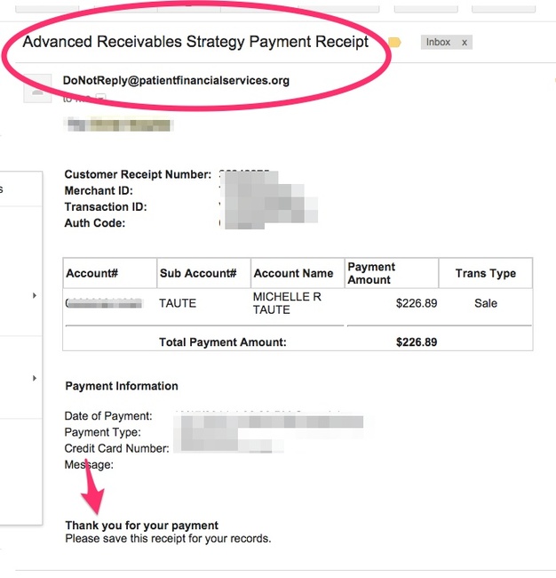
In about 10 seconds, I went from feeling warm and fuzzy about the hospital that shall not be named to feeling angry and used. The subject line “Advanced Receivables Strategy Payment Receipt” made me imagine Mr. Burns from the Simpsons twirling his fingers in a cold sterile boardroom as he tried to up his profits by hook or crook.
The from address “DoNotReply@patientfinancialservices.org” pretty much screams out “don’t ask any questions.” And while it ends with a curt thank you message, there’s no alternate contact information in case there happened to be a problem or error with the receipt. I went from warm human customer service to being part of a nameless, faceless business strategy in 20 minutes flat.
This particular hospital clearly paid careful attention to one part of the user experience and very little to those final details. I’m sure my receipt was automatically generated by software, and no one thought to engage a copywriter for automated email receipts. The team was probably so caught up in the technical delivery that someone just ripped that subject line off a soulless spreadsheet.
After my rage subsided, I remembered a really cool email I’d received about six months earlier after ordering business cards from Moo.
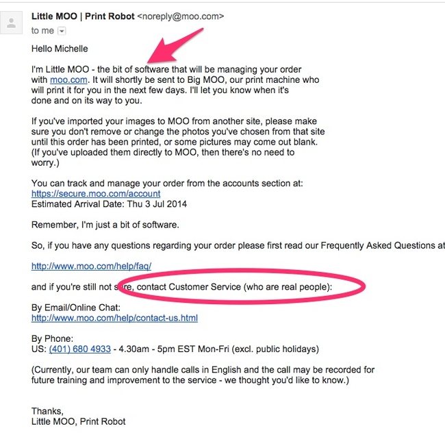
This, too, was an auto response email to confirm an order and payment. But the approach and user experience couldn’t be more different. They took the time to acknowledge that the email was sent by software, and a rather clever copywriter even gave that software a cute name, “Little MOO.” Just those first few lines alone make you feel a connection with the company.
While the email does come from “noreply@moo.com,” they’ve taken the extra step to tell me where I can get help. I can see at a glance how to log into my account or reach a real human being by phone or email. This whole auto-generated experience—from first word to last—makes me feel like this company actually cares. They turned a cold transactional email into an opportunity to start building a real human relationship.
It’s a stark reminder that all the little details matter. Sometimes a designer or developer will wander over to my desk and say, “I’m not sure if this is big enough to bother you with, but…” and ask for help with small bits of copy in an app. All those modals and confirmation messages and auto-generated emails count, and even if the code and pixels behind them are perfect, thoughtless copy can tank the whole thing.
There’s room to make connections in those little places and spaces of online user experience. In fact, I think that’s how we keep technology human and friendly. May we all strive to be as charming as Little Moo and promise to never ever make our users feel like cogs in a corporate business strategy.