18 January 2013
Mobile Web Apps: Are We There Yet?
As a non-Mac owner I remember seeing this promotional video from 37signals and feeling like I needed to buy a Mac if I wanted to be a great Ruby programmer or web designer. In Ruby’s culture there is a strong preference for Apple products.
“The great thing about Ruby on the Mac is that it just feels like they fit together.”
DHH
Because of this preference there is a lot of crossover between the Ruby and the iOS world.

I own a Mac Book Pro and an iPhone but I don’t feel loyalty to these products.
The reason I became a web developer is because I love open source software
and, on the web, open source is king. While everyone else was pirating
Photoshop, I was writing Python scripts in Gimp. I ran Warty Warthog
on my PC. I enjoyed a good game of Total Annihilation. And although Gmail isn’t open
source, web apps like this give Linux, Windows, and OSX users a certain independence from their operating systems that I enjoy.
Apple’s iPhone and iPad market share is impressive and I accept that the
potential to make money on these devices is compelling, but on personal
projects I am most excited about developing on the web where everyone (sort
of) can access my software.
So with the neckbeard sentiment out of the way, I want to share what I’ve
learned so far about developing mobile web apps. As I see it, there are three
levels of appy-ness.
Level 1 - Make It Fit On The Screen
Just throw a responsive framework on your site to make it look great on any
size screen! Okay, that didn’t work. Except for
the demo sites for these libraries, I haven’t seen a responsive website yet
that could just use a CSS framework without any manual tweaking. It’s time to
dig into CSS media queries so that
people get a good experience on their phones as well as a computer monitor
Even on this very simple stage of mobileness, new developers are going to be
surprised to find that laying out your HTML views for mobile isn’t trivial.
Take a look at this presentation deck
for a good primer
Level 2 - Minimize the Effects of Connection Latency With Asynchronous UIs
This is where I get really passionate about the design of applications. Maybe
it’s because I’m impatient and I like fast UIs. Maybe it’s because I used
Lotus Notes for 5 years, an application which after 23 years of development
still blocks the entire UI when fetching an email, rending all Notes
application unusable if you happen to be on some abysmal guest wireless
connection while tunneling through a VPN server in Tampa. Yeah, it’s probably
that.
When I try out mobile web apps, this is where I see the biggest problems. When
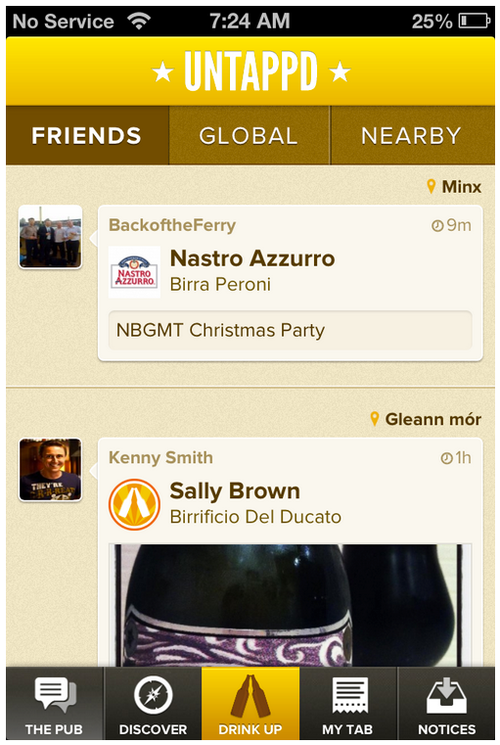
I first looked at PhoneGap, the top featured product was
Untapped. The screenshots look great, but
it feels like you’re just tapping around a very pretty web page when you use
it. Tap the bottom navigation and you’ll see a spinner followed by a complete
refresh of the page. User expectations for a native app are that the UI is
always responsive and available, even if it needs to do something like fetch
remote data. A refresh is a break in the experience, and a dead giveaway of
the traditional web request cycle. For more of these issues also see Sencha’s Blog post on Fastbook where they demonstrate several places where Facebook’s native app loses state and local data when switching views

For a web app to feel responsive one needs to make a huge shift away from
simply rendering web pages after an HTML request. This means more
responsibility on the client is required: client-side template rendering,
local data caching, and optimistic responses to user actions. My favorite
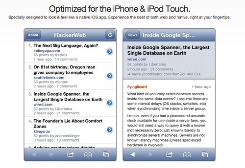
article covering these ideas is still this one from Alex Maccaw. Also check out the second post about the creation of the Hacker News Web App. Chee Aun has an awesome implementation of the HTML5 Application Cache
that only downloads new assets if the application version has changed

For me, the technologies that enable these asynchronous UIs are the most
exciting things in software development today. Frameworks like Backbone.js and
Ember.js, push events via Server Sent Events and Websockets, and all those
fancy CSS3 tricks make developing fast webapps possible.
Level 3 - Platform Integration
It won’t be too tough to get your app to fit on that tiny mobile screen and
you’ll be able to make a lightning fast web app using rich client
technologies. But when it comes to platform integration we’re a little stuck.
If you want to take a photo, use the GPS, or run your app outside Mobile
Safari, you’ll need to hunker down with some native code.
It seems that the current sweet spot for cross-platform mobile apps is a
hybrid web / native app. A hybrid app uses a native code wrapper around HTML
web views, so that the majority of the functionality can be shared across
different platforms. In this way, you can update your application and avoid
the bureaucracy of an app store approval process. You can then fall back on
native code for smooth animations, native-looking navigation, and access to
proprietary APIs. LinkedIn has been very public about their hybrid web
app and
although Google hasn’t said much about the new Gmail and Maps apps, it is
clear that they are using HTML for most of their views.
Are We There Yet?
If you want to make mobile apps with no compromises, you’ll want a completely
native application on whatever platform you choose. Have fun with your piles
of money and great user experiences.
If you need a cross platform app, you’ll benefit from liberal use of web views
to minimize the amount of native code required on each platform. This is the
approach I would use to create a practical web application that needs to work
today.
As tempting as Apple’s native world is, if you dream of Chrome Apps, Web Canvases, and App Cache Manifests like I
do, you’ll be pushing the boundaries of the mobile web.


