15 July 2013
Style Guides: Or How I Learned to Stop Worrying and Love the Grid
Bam, I have created the perfect design. Every checkbox is in place, all the type is perfectly aligned. Oh wait, I resized the window and everything IS WRONG. One of the things I miss the most about print design is the certainty that an element will appear precisely where I have placed it in the page. I know exactly the number of words on a page and it will not change. That level of control really appeals to my perfectionist personality.
When I made the jump to the web, I still wanted to do full-on mockups. All this accomplished was giving the client a reason to be angry when things didn’t turn out exactly the same. A year later and a year wiser, I’ve finally embraced the fact that I can’t control everything, but I can control the important parts. Combine a framework for a responsive grid and careful design of the main page elements, then throw it all together and let it do it’s thing.
Ok it’s a little more complicated than that. My saving grace has been style guides. They come in a variety of names, but for this purpose, a style guide is a compilation of a site’s main elements. This usually consists of buttons, navigation, and anything along those lines. By establishing a strong visual style through the page elements, the feelings behind the design still come through.
The Style Guide Process
Create Wireframes
Like any good interactive project, start by creating wireframes of the project. Hand sketches are perfect for this. Your main takeaway from these is to establish what elements you think will be used more than once on a page. This can range from icons to pagination. Make a list of these elements. I would try to limit this to around 10 elements. Of course, you’ll end up with changes down the line, but hopefully this will cover the majority of your elements.
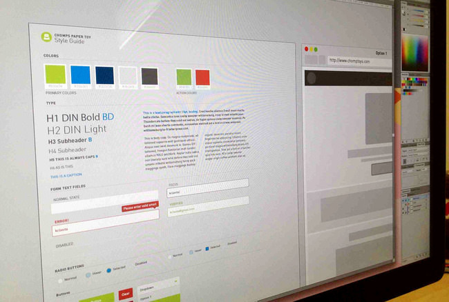
Create Cohesive Element Page
In theory if you’re a bad ass and design straight in the browser, then you can skip this step. Personally, I like to use Illustrator to help get my thoughts in order, without fighting with implementation. Start by creating a grid based on your framework. Then slowly start building your elements. Do the design dance until you have a page of elements you think work together and represent your project well. Although this is a lot of work upfront, I have used my initial elements page as a template for other projects.
HTML Styleguide
Great! You know what you want things to look like. There are a variety of styleguide templates out there or you could chose to create your own. Again, there is a lot of work upfront, but if you plan on making this your workflow, it’s worth it to establish your own template. Creating classes that you are comfortable with and know is worth the effort. Knowing you want to have 3 different styles of buttons, allows you to create cohesive class names. I start by creating all the markup in HTML first, then go in and add the styling. In the end, you should be left with a fully functioning page of elements that you can pull class names from to style your actual pages.
Conclusion
Although the workflow is a heavy upfront, having a cohesive guide of elements for a large project ends up being worth the effort. As we all know, a website is never done. Style guides allow for flexibility to grow a site, while also having it stay within the correct brand guidelines. If a project is handed off, your extremely helpful and thoughtfully named classes will make the design of the site very easy. Easier, cohesion, and it makes a cool page. What more can you ask?


