6 May 2019
Vertical Rhythm on the Web
Grids are a thing. They’ve been a thing. There’s nothing earth-shattering about designing on a grid. In fact, it’s so commonplace that there are, what feels like, an infinite number of tools available to make it easier to design on a grid—Bootstrap, Foundation, Bulma, among others. But there’s one thing these tools all have in common, and it’s what they’re missing. Verticality. (Is that even a word?)
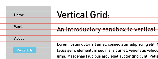
Ever come across a site that is laid out beautifully across all screen sizes? It responds as you narrow or widen your window, the sidebar wraps effortlessly as real estate becomes sparse, the gutter spacing between elements is consistent; it’s glorious. But then you start to scroll. There’s weird white space between the header and main content, the footer feels like it’s falling off the page, content starts to run together and hierarchy is lost. That’s what I’m talking about. It is so easy to create and maintain these horizontal grids, but the structure is lost as you move down the page — but it doesn’t have to be!
I’ve long envied the blog post that showcases a site falling effortlessly into a vertical grid. It’s always been this thing that I aspired to do, so I decided to finally demystify it. And, thankfully, it’s really not too complicated.
Establishing the grid
First things first, we have to decide on and set up the vertical rhythm on the page. So, where to begin? What is a vertical unit we already have in our arsenal? Line height. Every site has content; all content has a line-height—Let’s go with that!
Let’s assume our site has a base font-size: 20px; and a line-height: 30px;
html, body {

font-size: 20px;

    line-height: 30px;

}
If our base line-height is 30px, then we should run with a 30px vertical grid. But what does that mean? That means that we need to use 30px as a base unit for spacing throughout the site; everything should be in multiples of 30px. And voilà — we’ve got a vertical grid.
Want some space between those consecutive .form elements?
.form + .form {

margin-top: 90px;

}
Need some breathing room inside that .sidenav?
.sidenav {

padding: 30px;

}
Your <h1> not fit inside those 30px?
h1 {

font-size: 50px;

line-height: 60px;

}
Where is gets tricky
Great! It’s that simple: set a base line-height, then just use multiples of it for everything in your system. But there are some snags we need to address before this can work entirely.
Browsers like to add in their own default declarations.
We need to strip the browser of its default spacing. This means the sizing, padding and margins on the body, h-tags, lists, links, etc. so that we’re starting from the ground up. We want to strip everything away so that we can build it back up again onto our grid. So, in our base styles, let’s add
html, body {

margin: 0;

padding: 0;

}


* {

line-height: 30px;

}


h1, h2, h3, h4, h5, h6, ol, ul, blockquote, p {

margin: 0;

}
Scalability & Maintainability
Cool, cool, cool. That’s great and all, but what if I want to change my grid after I’ve spent some time with it? Sass to the rescue!
To set up a more maintainable and responsive vertical grid, we’ll want to use the power of Sass variables and functions to our advantage. Thankfully, it’s not too complicated. We just need three variables and one function and we’re off to the races.
Variables
$font-size-base: 20px;

$line-height-base: 1.5;

$grid: $font-size-base * $line-height-base;
Function
@function grid($count) {

  @return calc(#{$grid} * #{$count});

}
Where $count is the multiple of grid lines we want to use. So, calling grid(1) would return 30px, grid(2) would return 60px, etc. This allows us to declare grid lines without hard-coding any values.
So, our grid setup would look something like
html, body {

font-size: $font-size-base;

line-height: $grid(1);

}


* {

line-height: grid(1);

}
And using the grid would look something like
.form + .form {

margin-top: grid(3);

}


.sidenav {

line-height: grid(1);

padding: grid(1);

}


h1 {

font-size: 2.5em;

line-height: grid(2);

}
Aaand we’re done!
Tada! That’s how you set up and maintain a vertical grid. It’s just a few lines of code and a lifetime of happiness. Okay, maybe that’s an overstatement, but I love when I learn that something seemingly complicated is actually really simple. It’s a beautiful, beautiful thing.
Want to try if for yourself? Play with this Codepen!


