14 May 2020
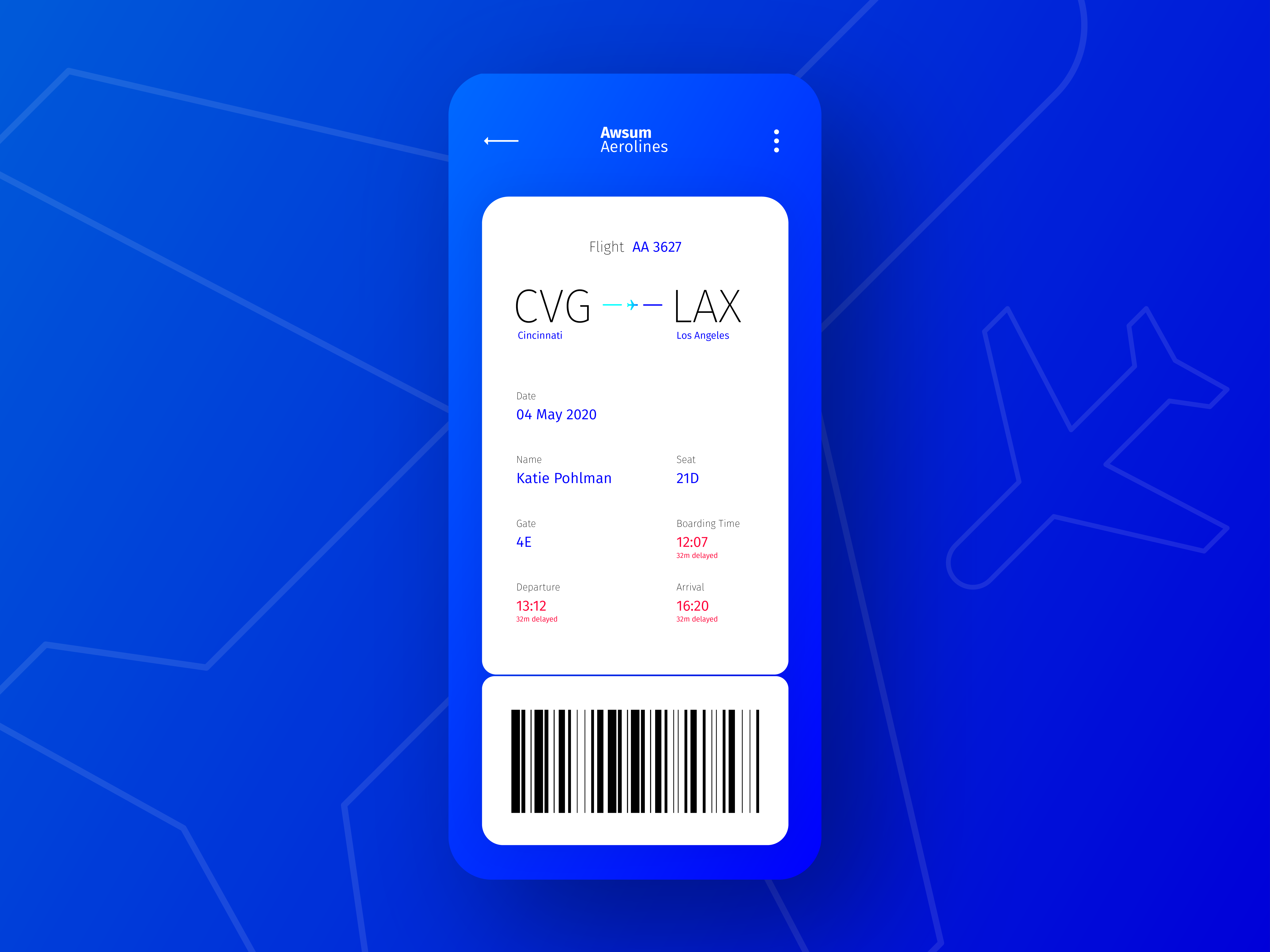
Weekly UI #5: Mobile Boarding Pass
“Good afternoon passengers, we are now boarding zone 1.”
Imagine we are going on a plane trip. We hope to have a seamless boarding experience at the airport with this boarding pass design. I’ll talk through the organization of information and touch on some color theory. This is an example of working through creating a digital form of the physical version while keeping some integrity of the tactile experience a user has with their ticket.
“Now boarding all zones!”
Heads up! This article may make reference to the Gaslight team—that's still us! We go by Launch Scout now, this article was just written before we re-introduced ourselves. Find out more here.


