5 August 2021
CSS-Only Avatar Fallback
This post has an updated solution. Check it out
Avatars are everywhere—and no, I’m not talking about the blue aliens. I’m talking about the little pictures that show up next to your name when you’re logged into an app or website. They’re even on our phones now, as part of group texts or contact cards. Avatars are super functional and also add some visual interest to a screen, especially when users have uploaded a profile photo. But what happens when they haven’t? That’s what we’re going to talk about today.
When styling avatars, it’s pretty easy to get them to look how you want with or without an image to display. It’s less easy to dynamically show the appropriate version. Of course, you can always sprinkle conditional statements throughout the front-end codebase, but that can get messy and tedious to maintain. Or you can use this super slick CSS-only fallback that a friend and fellow Gaslight Designer, Ryan Arthur, showed me. (He’s a gem!)
First, you start with your basic markup. We’ll assume we have an image to display.
<div class="avatar">
  <img src="https://thispersondoesnotexist.com/image/" >
</div>
And your CSS may look something like this:
.avatar {
  height: 2rem;
  width: 2rem;
  border-radius: 50%;
  overflow: hidden;
}

.avatar img {
  max-width: 100%;
  max-height: 100%;
}
Now here’s the fun part. Add an `alt` attribute with the user’s name to the `img` tag.
<div class="avatar">
  <img src="https://thispersondoesnotexist.com/image/" alt=”User Name”>
</div>
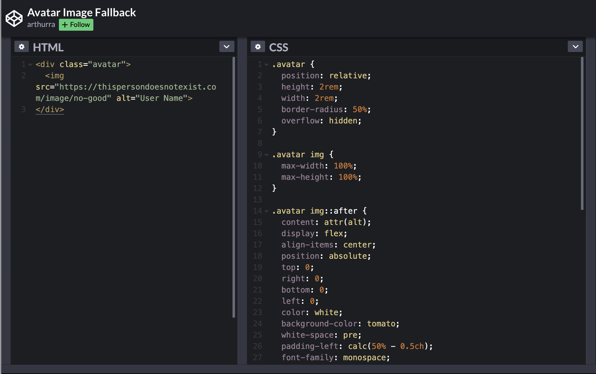
The fun bit is that when an image link is broken or missing, it suddenly has an `::after` pseudo-element that you can select and style however you’d like. So we can use our `alt` text in combination with the `::after` element and update our CSS to be something like this:
.avatar {
  position: relative;
  height: 2rem;
  width: 2rem;
  border-radius: 50%;
  overflow: hidden;
}

.avatar img {
  max-width: 100%;
  max-height: 100%;
}

.avatar img::after {
  content: attr(alt);
  display: flex;
  align-items: center;
  position: absolute;
  top: 0;
  right: 0;
  bottom: 0;
  left: 0;
  color: white;
  background-color: tomato;
  white-space: pre;
  padding-left: calc(50% - 0.5ch);
  font-family: monospace;
  letter-spacing: 2rem;
}
We add `position: relative;` to the `.avatar` class and then absolutely position and style the `::after` element, which uses the `alt` text as its content. Next, we style the text to only display the first letter of the user’s name. To do that we’ll use a monospace font so our character widths are predictable, set the `letter-spacing` to our avatar width to make sure you will only ever see the first character, and then use the `ch` unit to perfectly center the character in its parent container.
And wala! Now we have a seamless fallback for broken or missing image links that doesn’t require littering our codebase with conditionals. For me, it’s always easier to learn by doing, so here’s a link to a codepen that Ryan put together. You’ll see the broken image link when you load the page. Simply remove ‘no-good’ from the image link and let the pen reload, then you’ll see the magic in action. Happy coding!


